

[Pay graphs updated Aug. 19, 2026, described below.] The University of Oregon (UO) has budget problems, a shortfall of around 25 million dollars per year that will expand if unchecked about 65 million dollars per year, driven largely by falling out of state enrollment (link). For scale, UO’s total annual budget is around $1.8B, and the “Education and General” fund that’s relevant to the shortfall has about $680M/year in expenses. UO isn’t unique — financial problems are plaguing many US colleges and universities as growing expenses collide with a shrinking student pool. As is the case for many universities, UO’s salary information is publicly available, and salaries are the bulk of its expenditures. Parsing this data is tedious. I started poking at it over a year ago but I lost enthusiasm. Now, however, recent developments spur me to revisit this. Plus, AI programming tools are excellent (even more so than last year) and are ideally suited to mechanically straightforward tasks like this. It is, I think, important for faculty to be aware of financial data, in part to suggest perspectives that may not be obvious, especially as administrative responses in the recent past have targeted faculty, nontenured instructors, and graduate students for culling. Are these the groups that drive increasing costs? This is a question that can be addressed with data.
If you want the one-sentence summary: Faculty are the biggest personnel expense for the university, but the largest growth over the past decade, by far, has been in administrative costs: Vice Presidents, “Directors” of various sorts, and the like.
Graphs and more
I focus for now on faculty, instructors and “unclassified staff,” a category that includes administrators of many types and the people who run a wide variety of campus services. See here for a definition. I downloaded all the UO salary data from 2014-15 through 2024-25. These are available as PDFs link; 2019-20 is missing, likely due to the Covid pandemic. To facilitate analysis I had Claude write code to convert each PDF into a CSV file, which, as I knew from past experience, is non trivial because the PDF structure is oddly complicated.
Then came the mildly interesting task of dividing the job titles into categories and charting how their numbers and costs have changed over the past decade.
How much has the provost’s office grown? Do we have more non-tenured instructors than a decade ago or fewer? Are we drowning in associate deans?
I’ll show some graphs now and then describe the categorization. Note that the numbers are not adjusted for inflation.
First, the total salary expenses for a subset of categories over the past decade:
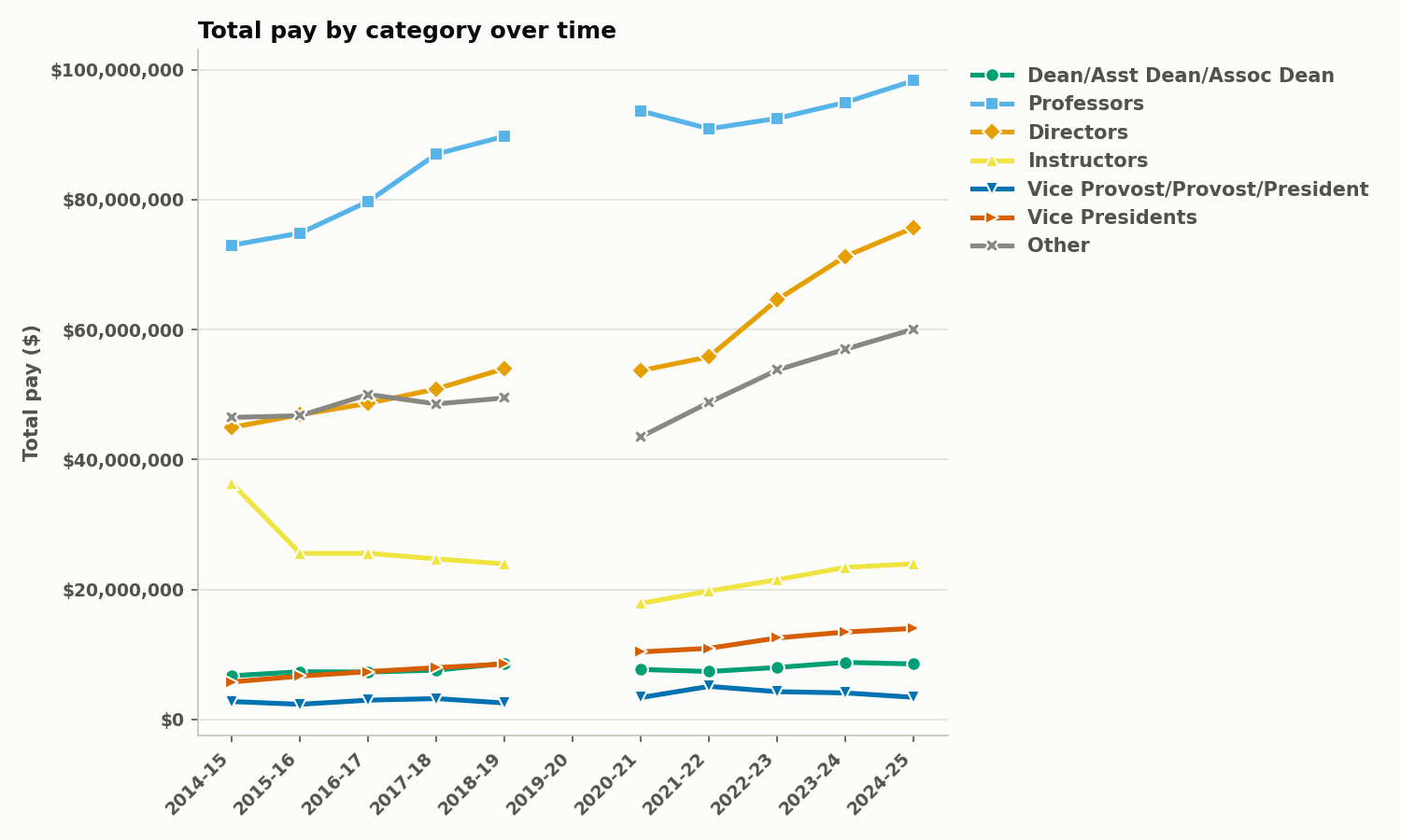
Update (Aug 19, 2026): The original version of this graph, which you can see here if you want, had a large discontinuity for the “Professors” category at FY2019-20 that several people commented on. (Thanks!) This arose because the the pre-2019 salary data was recorded differently than post-2019. For the latter, the PDFs note the actual total pay. Before 2019, it’s a mess, often with multiple entries per person tabulated in ways that aren’t consistent across departments. I’ve finally — with Claude’s assistance — made sense of all this, or at least enough sense to be fairly confident updating the graph. Still, be a bit careful about comparing pre- to post- 2019. The post-2019 data is all of the same form, and, if anything, the rise of the Directors / Others / VP categories is even more pronounced if we only look at the last five years.
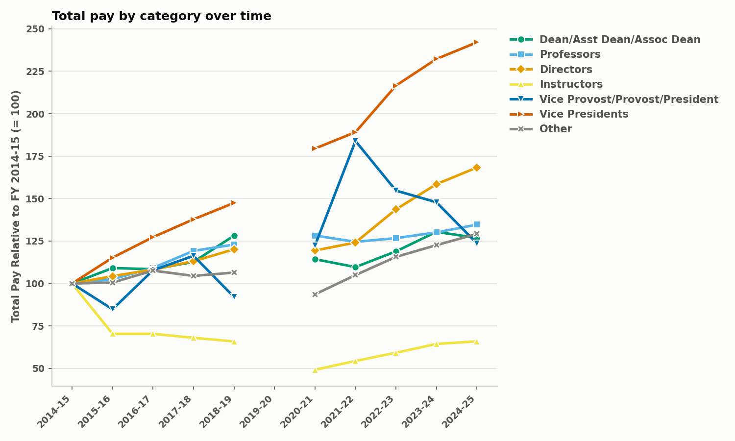
Next, the change in total salary expenses relative to the 2014-15 fiscal year:
And as a percentage of total unclassified personnel salary expenses:
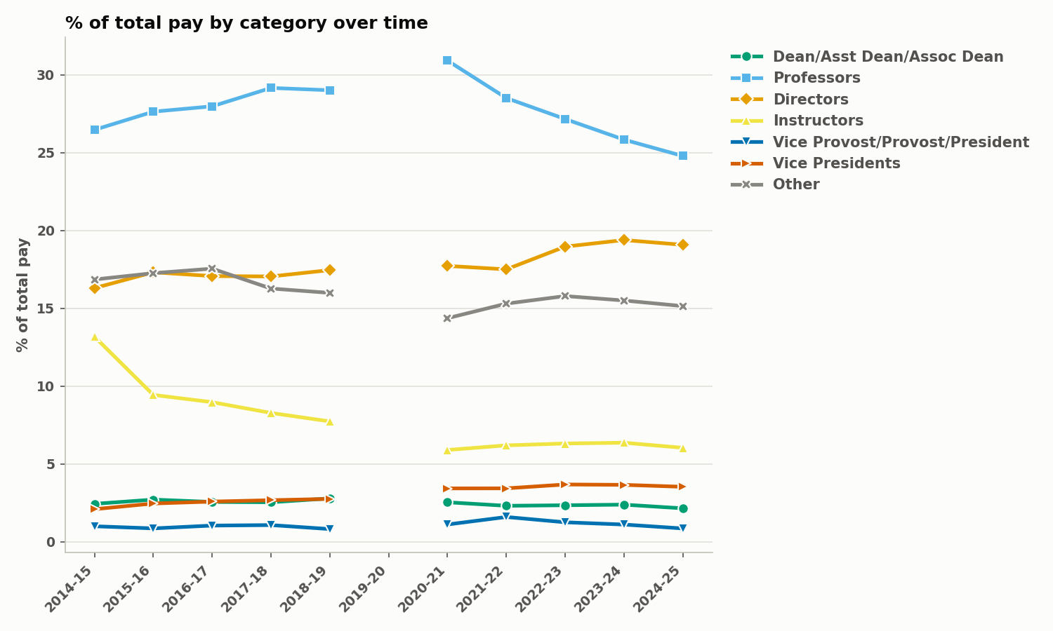
Keep in mind that I’m plotting a subset of the categories (the interesting ones). The full list is linked below.
Categories
These categories are not official groupings, but we need some way of organizing many thousands of positions. Some categories are obvious and straightforward to propose, such as “Professors,” which includes all tenure-track and tenured faculty. “Instructors” is also straightforward. For many of us, the key question is how these two categories compare to everything else. (Note that graduate students, whether teaching assistants or research assistants, are not in the unclassified personnel list, and so aren’t part of this analysis.) Other groupings are less obvious. Constructing the categories involved using a combination of my own knowledge, Claude’s (Sonnet 5) parsing of titles and, more subtly, their meanings, corrections and queries as I skimmed the CSV files, and iterations of all these steps. In the end, here are the categories and their descriptions, along with their cost in 2024-25:
I can post the list of all job titles and what categories cover what positions, if it’s of interest.
Commentary
As mentioned, this is a minimal post, and I’ll be minimal in my commentary.
Some clear trends:
- The money going to faculty (tenure track faculty and instructors) is fairly flat. (It’s decreasing in inflation-adjusted dollars, which I haven’t plotted.)
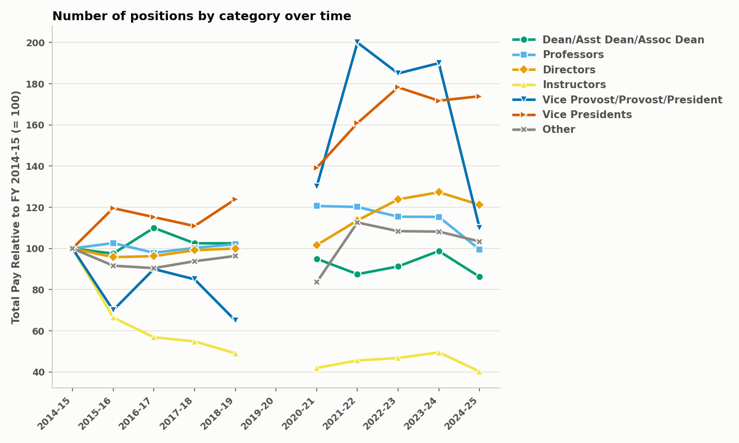
- Expenses associated with Vice Presidents of some sort or another have ballooned. There were 69 positions in this category last year, e.g. “VP for Student Svcs Enrollment” Two “Assoc VP of Comm Relations”, “Asst VP Regional Philanthropy”, …
- Expenses associated with “Directors” have grown enormously, and are a sizeable chunk of our overall expenses. There are currently 852 director positions, such as 11 “Community Directors”, “Director, HR Community of Practice”, “Prgm Dir Neuroscience”. Many of these are secondary roles for faculty, such as research institute directors.
It is also useful to see the number of positions over the past decade. I’ll just show the relative changes.
I’ll restrain myself from sharing my opinions on these trends, except for the following short paragraph:
The administration, quite correctly, notes that faculty are the largest expense. The faculty are not, however, the largest increase in expenses over the last decade. I suggest that it would be sensible to correct for unsustainable growth rather than slicing core components of the university. If, for example, we reduced our spending on “directors” to 2018 levels, we’d save $20M per year. Of course, we’d have less direction, but I don’t remember wandering around aimlessly during that time.
This is not a conclusion I would have realized before looking at the data, so I hope others on campus and beyond take a look as well. We can hopefully devise creative solutions to our budget problems.
Choose your own adventure
There are many more graphs that could be made, and analyses that could be done, but I’ll leave this post in a somewhat minimal state and encourage people to write to me (or comment) about what they’d like to see. More specific categories? Salaries per position? Inflation adjusted? Normalized to tuition? An interactive dashboard (like this)?
I also recommend, by the way, my 2021 post on tuition if you’re unfamiliar with the overall landscape of income at our nominally public university
Today’s illustration…
A chair, from a photograph I took at the excellent Seminary Co-op bookstore in Chicago. I just learned that it’s a Jens Risom lounge chair. I thought it would be quick to trace the outline and paint the rest (I was wrong), and relaxing to paint the rectangles of overlapping fabric (I was right). It looked better before my clumsy addition of indigo shading, but it’s still decent enough to post.
— Raghuveer Parthasarathy, August 11, 2026


How could you have forgotten to mention the Senior Vice Provost for Accelerating Demoralization?
Could you look at how the data compares with OA pay bands instead of title? Director is an overused term, but a Community Director that lives in the residence halls has a limited scope compared to a research or academic program director. This might also weed out the people who have inflated title in place of real compensation.
OA Compensation Structure | Human Resources
Thanks; this is a good idea, or more generally looking at the growth of different salary ranges.
I think spelling out direct instructional staffing vs non-instructional staffing expenses in general would be helpful — even just these two lines without breaking down into further categories.
RE: above comments about housing directors. To my understanding, UO claims all their housing programs are “self-funded” (similarly to athletics). It would seem to make sense to also break the relative rise in staffing expenses down between these “self-funded” areas of UO compared to the other areas not described as “self-funded”.
Lastly, I do think many people would be interested to see some of these numbers adjusted for inflation! A huge part of the story (IMO) is that UO built its budgets with the assumption that workers would simply absorb the historic costs of inflation in the 2020s, and they’re still operating that way. But the cost of labor has simply gone up and it isn’t employees’ job to absorb that difference for the employer!
Thanks for all your work on this — so appreciated as a non-numbers person 🙂
Thank you! Good point about inflation, and I should certainly do something to illustrate this.
About housing: I hadn’t thought about this! A quick look at “housing” in titles shows about 80 people (an increase from about 60 a decade ago), and total salary around $5M, so it’s not a large chunk of the total. Note that all of this analysis is only for unclassified staff; I’d guess that the bulk of housing personnel are classified staff.
I’ve built something similar to this and posted it on github (it’s still a work in progress): https://uofinancials.github.io
I’ll check it out — thanks!