

If you’ve ever wondered: What has the enrollment in the introductory “Physics with calculus” (PHYS 251) course at the University of Oregon (UO) been over the past 30 years? What about Business Administration 101? You’re now in luck, because I’ve made an online dashboard that allows you to plot the enrollment history for any UO course you like.
You may be thinking, “I couldn’t possibly care less,” which is understandable if you’re not connected to the University of Oregon. There are some general lessons that may be of interest, though, which I’ve noted in the “Towards General Lessons” section.
Update May 31, 2026: I learned that UO is working on an official visualizer of course enrollment! The pilot version is available only within UO, and I think faculty may have to request access. Link (click “Enrollment History”) and request link. It’s by Austin Hocker, who does excellent work on UO data analysis and is very open to suggestions.
Known bugs, as of May 31, 2026: Earth Sciences (ERTH) changed course subject name from Geology a few years ago, and I can’t access any old records under “GEOL”. Perhaps they’re buried in sediment somewhere.
A brief tour
Click here for the dashboard. You can select courses to plot from the left-side panel, clicking “Add” to add them to the list to plot. Here’s what you should see if you pick “PHYS 251” and “CH 221” (General Chemistry):
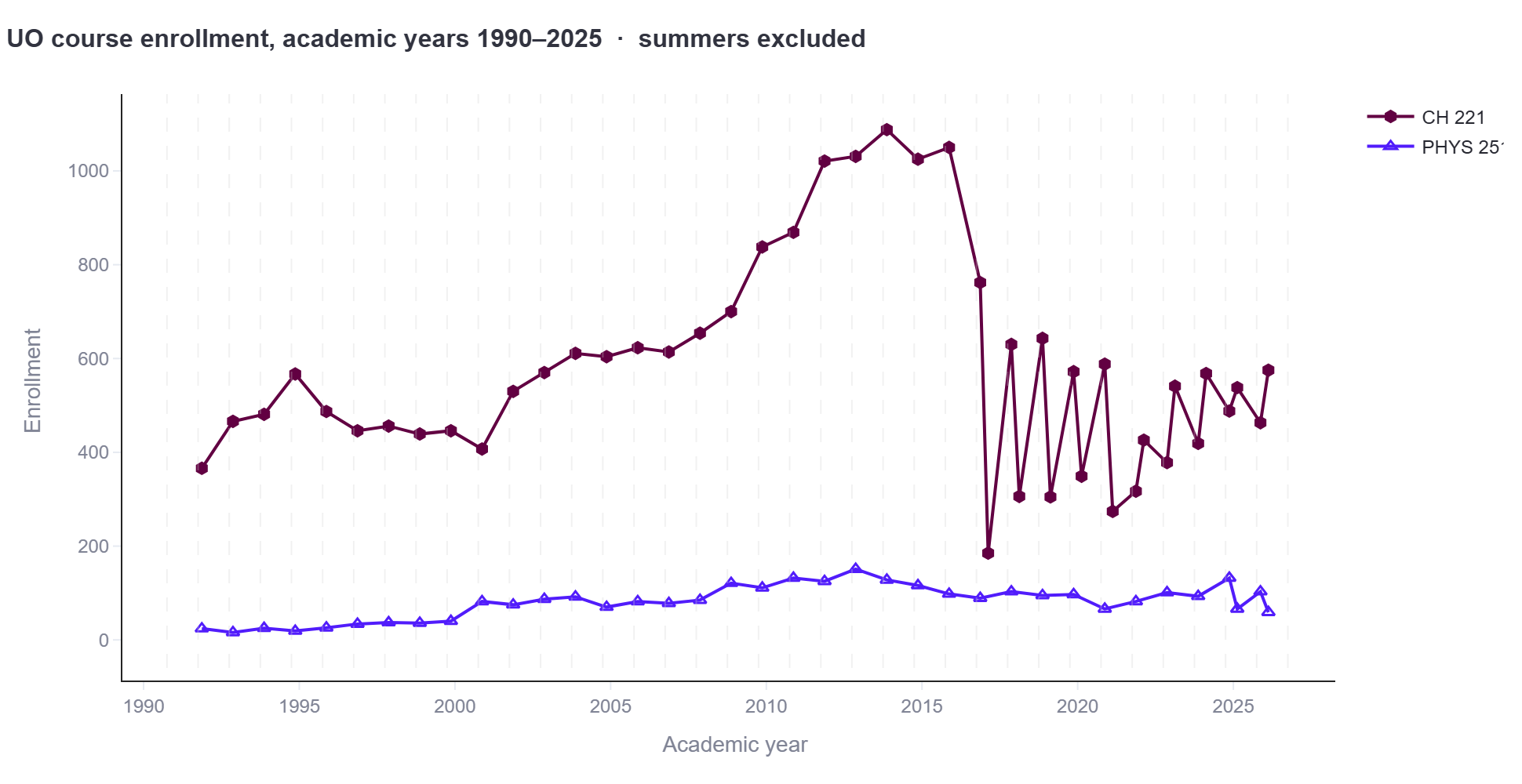
Catalog descriptions of the courses are given below the plot, by the way.
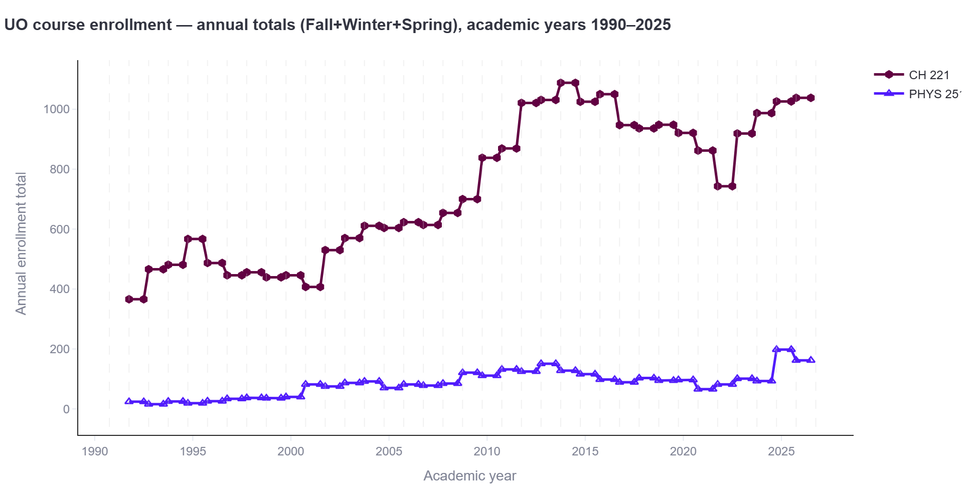
The graph looks very jagged, mainly because the same course can be offered more than once per academic year. We can select “Sum enrollment by academic year” from the options on the left to plot the total academic year enrollment of a course. This gives:
To compare trends, we may want to normalize by the initial value of each course’s enrollment, which we can do with the “Normalize to first non-zero term” switch on the left:
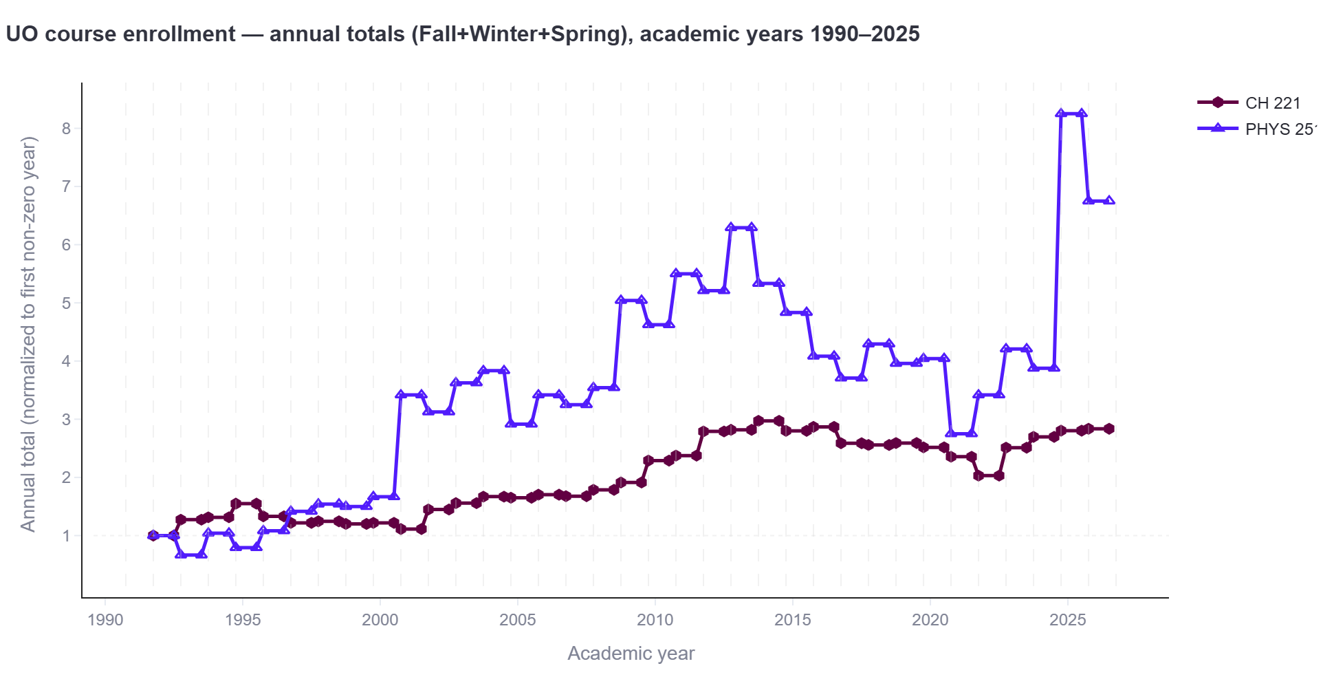
The graphs may spur questions. For example:
- Why did PHYS 251 enrollment rise in 2024-25? In large part because we started offering the course twice per year, as an experiment. (Strangely, though it attracted a lot of students enrollment in the subsequent term-offset courses was low, and so we ended the experiment.)
- What happened to PHYS 251 enrollment in 2000? According to the schedule, we used to offer a different Introductory Physics with Calculus course, Physics 211, before 2000; presumably this got merged with PHYS 251. (I wasn’t here then.) Plotting PHYS 211 and 251 looks as one would expect; you can try it.
Here’s another pair of courses: Business Administration 101 and Economics 201, again summed over the academic year. (Again, course descriptions are below the plot.)
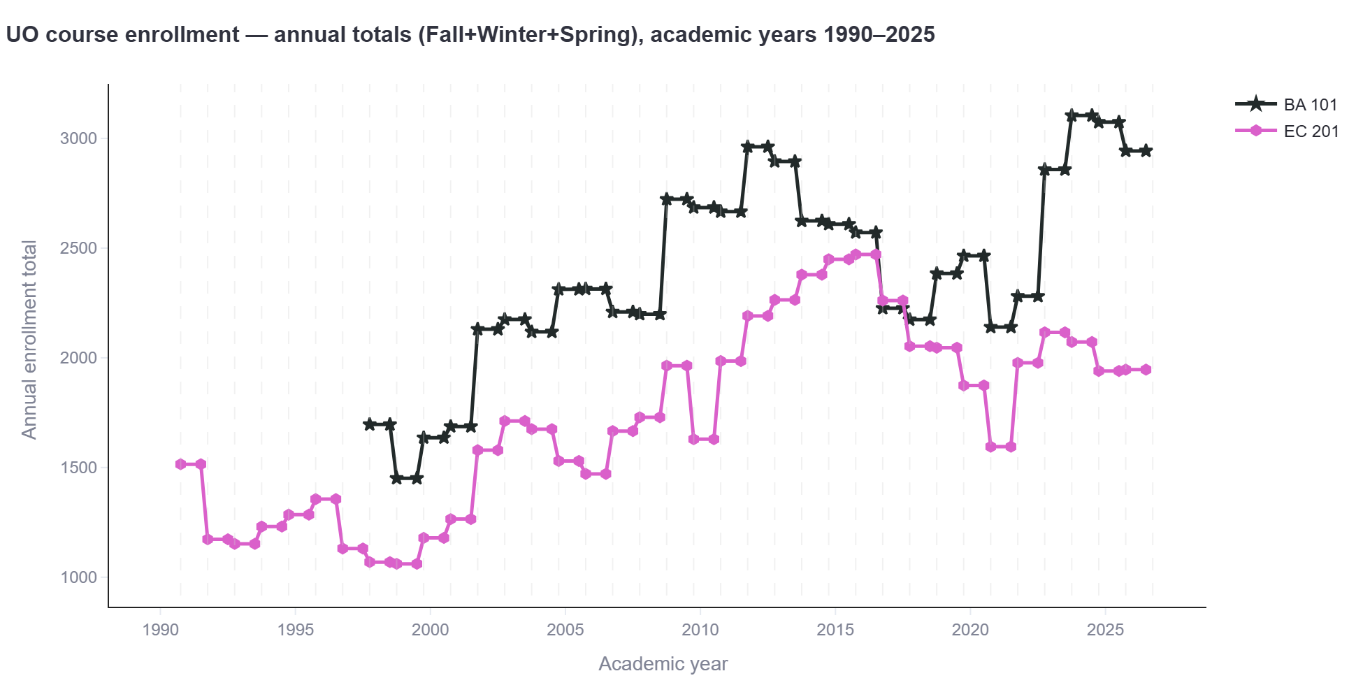
The numbers are enormous: about 3000 students per year take BA 101. We have about 25,000 total undergraduates, meaning that about half of them take “Introduction to Business” at some point.
The parallel but then divergent trajectories between Economics and Business Administration are interesting; I don’t have an explanation.
You can try for yourself something like J 201, which is now JCOM 201; the two have to be plotted separately.
The making of …
I’m working on a variety of things related to the UO Physics curriculum, in part because I’m chair of our department’s curriculum committee, and in part because I find these sorts of explorations interesting and important. (See e.g. some recent posts, like this and this). Today’s enrollment dashboard is the least interesting or important of these activities, but I’m posting about it because it’s mildly entertaining, it’s self-contained, and it highlights the uses and abilities of current artificial intelligence tools.
I wrote above that I “made” the dashboard. More accurately, I designed it and outsourced all the code writing to Claude (Opus 4.7). The steps were:
1 Downloading all UO Course Schedule data, which contains enrollment data, from 1990 to the present (Spring 2026). All the schedules are online, but I didn’t want to have later programs constantly prodding UO servers, so I decided to keep all the data locally. This step itself involved AI-generated code. This took some work — URLs are long, and there are various issues with how the schedules are formatted that I had to delineate, some on my own, some in response to Claude’s questions. In the end, I have all the course schedule data as CSV files.
2 Download current (2025-6) course catalog data for all subjects. This again was done by AI; my prompt is here.
3 Describe the dashboard. Most of my prompts and responses are here; see especially “Here are features the dashboard should have”.
4 Implement; make a few revisions. One is the “Z” suffix on some course numbers, which should be merged with earlier non-Z numbers. (For example, Chemistry 221 and 221Z.) Claude performs the merger and, without my asking, somehow researches the reason for the “Z” and notes it in the README file! (“UO has been appending the Z suffix to many introductory courses (CH 221 → CH 221Z, BI 221 → BI 221Z, etc.) to mark statewide-transferable equivalents.”)
5 Publish; play with the dashboard! I learned that Introductory Swedish has a greater enrollment than I would have guessed.
The whole process took a few hours.
Comments
If you have comments or observations, feel free to contact me or write a comment on this blog post.
Towards General Lessons
For the benefit of readers in the future: we’re currently at the point at which artificial intelligence can write essays and answer exam questions better than most undergraduates, can generate realistic video, can generate physics research papers, and more. In brief, my views of what AI should and shouldn’t be used for are as follows:
- Art: No
- Writing: Definitely not. (Depressingly, it looks like the winner of a recent short story prize was AI-generated. Why?!)
- Scientific Research: Yes, though I haven’t dived into this to any significant extent.
- The boring parts of programming (plots, code to slog through datasets): Definitely yes.
- The interesting parts of programming: Yes, though “interesting” almost by definition means that a human is involved in designing and evaluating approaches.
- Education: This is a difficult one, since my view is “yes” but with the caveat that this can be done very badly, and teaching students to develop their own skills is crucial.
- Administrative rules-based tasks: Yes. See below.
The class enrollment dashboard falls into the “boring parts of programming” category. I could write code to do this sort of plotting myself, but it would probably take me 30 hours and would be boring. More realistically, I would never actually spend so much time on such a thing. This, then, is a perfect task for AI.
The dashboard also intersects the “Administrative rules-based tasks” category. I looked into course enrollment and class schedules in part because I’m working on “maps” through the physics degree that hit the required courses given constraints of prerequisites and term-by-term scheduling. It’s not wholly a question of logistics; different types of students may want different sorts of maps, and this also should be considered. None of the factors involved are complicated or difficult, but it’s hard to keep them all straight in one’s mind. This is, however, a perfect task for contemporary AI, in concert with human-defined goals and iterative evaluation. There are a lot of tasks in academia that with an AI-augmented approach could be performed far better than is currently the case. At least here, however, this is rarely discussed, in contrast to AI’s impact on education itself. I will claim that these AI-augmented administration projects would best be pushed from the ground up by faculty and departments; otherwise they will end up bloated and frustrating like many of our computerized systems. Of course, a ground-up approach requires access to abundant and legible data. Hopefully I’ll elaborate on all these points sometime! (Probably not too soon — also in the queue are a post about some neat biophysics by oat plants, and perhaps a book update.)
Today’s illustration…
A mediocre sketch of a tablecloth. It’s all I’ve got at the moment!
— Raghuveer Parthasarathy, May 25, 2026


I strongly recommend you have your y-axes start at 0. As it is, the axis goes negative, which makes it tricky to visually compare the relative magnitudes of different lines.
Yes, I should have realized this, and others quickly pointed it out also. I modified the app, but I didn’t update the graphs I pasted into this post!
* Let me know if this isn’t working.
Also, you can click on the axis labels in the app and type in new values.