

[Update, Feb. 4, 2023: See the new & improved version of this post, here!] A remarkable graph I came across a few weeks ago, copied below, shows the changes in the numbers of students majoring in various topics between 2011 and 2017. Part of an insightful article by Benjamin Schmidt titled “The History BA Since the Great Recession”, it reports a sharp drop in history majors, a steep rise in exercise science and computer science majors, and a range of shifts in between.

I immediately wondered: do local trends here at the University of Oregon mirror the national trends, or is UO unusual? If you’re impatient, skip ahead a few paragraphs to “Visualizing UO vs the Nation” to see the colorful graph I made to illustrate this.
Thanks, but it’s really not a good graph
Since I already know how to find UO data on majors (see my “Guess the Major!” quiz of a few weeks ago), I thought it would be easy to extract the US-average data from the above graph. Unfortunately it isn’t. I wrote to the author, who didn’t reply — that’s fine, I have emails in my Inbox from months ago that I haven’t gotten to, either. I thought I could use one of the excellent web-based datapoint extractors for graphs, but this was impossible for a more interesting reason: looking more carefully, the graph is bizarre. Stare at the “quantitative” axis. To help, below I’ve cut and pasted parts of them without any re-sizing:
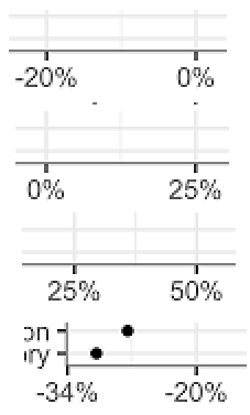
The distance from 0 to 25% is the same as the distance from -20% to 0 ?! The distance from 25% to 50% is smaller than the distance from 0 to 25% And who puts an axis tick at -34%? In addition to neither being round nor similar to the other ticks, it makes the 14% difference from -34% to -20% the same size as the 20% difference immediately to the right of it. I sincerely hope that this isn’t typical of the graphs history majors make…
The Quest for Data
As noted on Schmidt’s graph, the source of the data is the Integrated Postsecondary Education Data System (IPEDS) from the National Center for Education Statistics (NCES). I therefore went to their web page to get the numbers for numbers of degrees awarded over the past several years. The IPEDS resources are amazing, but overwhelming; I couldn’t figure out how to get what I wanted, so I wrote to their help desk and got a wonderfully helpful email response. (Thanks, Mike Williams!) I sketch the procedure in this file.
I got the IPEDS system to create CSV files of all degrees awarded in 2011 and in 2017 by all of the approximately 100 “very high research activity” universities in the Carnegie classification (of which UO is one). I’ve uploaded these files in case anyone reading wants them, here for 2011 and here for 2017. Each institution has a numerical code; UO’s is 209551. Each major has a code; Physics for example is 40.0801. (More on this below.)
For all the majors I cared to plot, I manually found the major codes from the IPEDS CSV files. A few required some adjustment: I assigned Human Physiology, a very popular major at the University of Oregon, to “Physiology (26.0901)” and also lumped it together with “Kinesiology and Exercise Science (31.0505),” which is more generally prevalent. I grouped some other majors together also; see below for details.
Visualizing UO versus the Nation
I decided to plot, for a variety of majors, the percent change in number of degrees awarded at UO vs. the average percent change at all the comparator schools. I wrote a MATLAB program to extract, analyze, and plot the IPEDS csv files. (The plotting required the most thought.) My code is available here.
Here’s the resulting graph:
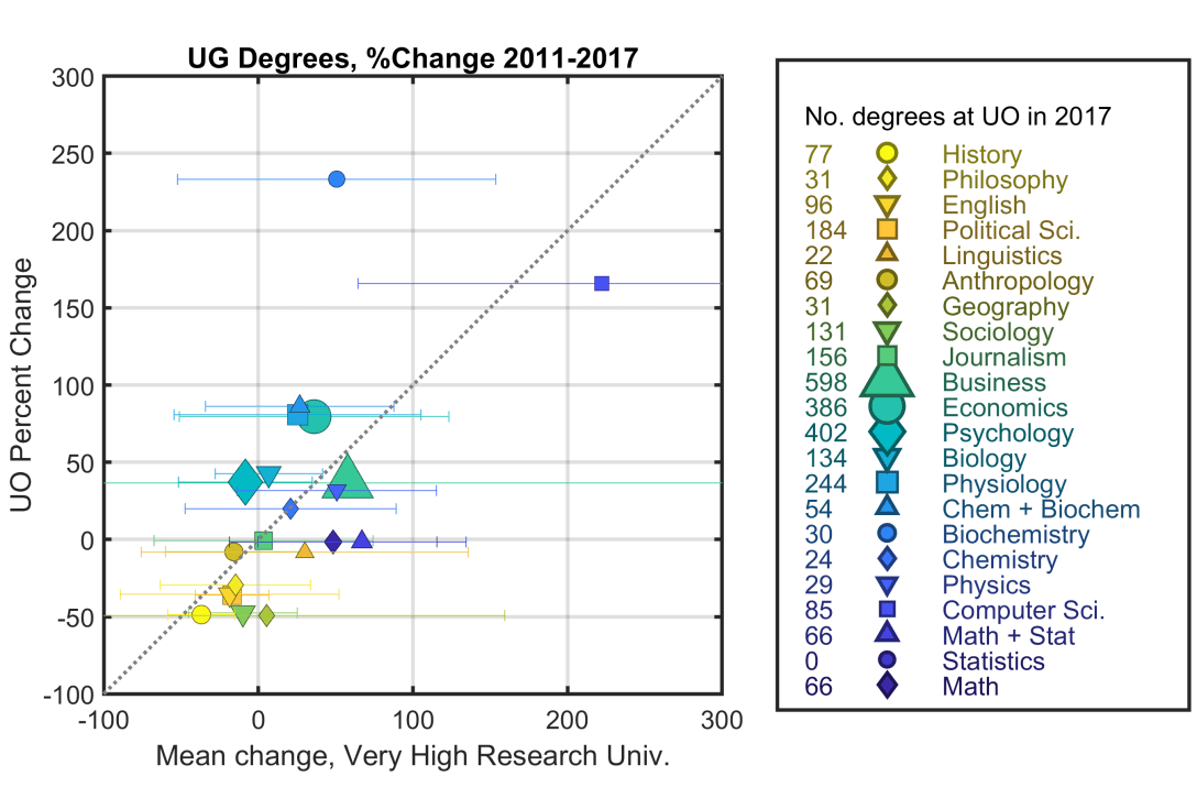
Observations
Points above the dashed line indicate majors that have grown more at UO than the average research university (or that have declined less). Points below the dashed line have locally declined more (or grown less) than average. The size of the symbols is a measure of how many degrees were awarded in that major. The coloring is a rough indication of subject type.
For the Carnegie very high research universities, as in Schmidt’s analysis of all universities, History has the largest drop in the number of majors: 37% from 2011 to 2017. At UO, the drop is 49%, similar to Geography and Sociology.
My own subject, Physics, is +51% among comparator schools, and +32% at UO.
The main conclusion that emerges from the graph is that UO is pretty normal. The error bars indicate the standard deviation across the ~100 comparator schools. For almost all the majors this standard deviation is large, and it crosses the 1:1 diagonal. In other words, for nearly all majors, UO is within a standard deviation of the mean. Validating Betteridge’s law of headlines, the answer to the question “Do Oregon students choose offbeat degrees?” is no. (For the listed majors, at least, though this does include most of the popular subjects at Oregon.)
The most anomalous point is the Biochemistry major, +233% at UO, and +51% among comparators. (The total number is not larrge, though: 30 degrees in 2017.) Interestingly, if one lumps Chemistry and Biochemistry together — at UO both are offered by the same department — the numbers are 86 and 27%, local and national. (This lumped point is also shown on the graph.) Chemistry alone is +20% and +21%.
Statistics has a +300% rise, on average, at comparator schools. It does not exist as a major at UO, but I created one datapoint that combines Math and Statistics; this gives -1.5% and +67%.
There are lots of other observations one can make; I’ll leave this as a parlor game for the reader. Keep in mind that only two years (2011 and 2017) are being compared.
Misc. Notes on Methods
I grouped several majors together under “Business,” and it’s still probably not complete. Similarly, “Computer Science” includes both Computer science and “Computer and Information Sciences, General” — there are many other majors (elsewhere) that could legitimately be combined. My Journalism combines journalism, broadcast journalism, radio and television, and “journalism, other.” Economics also includes Applied Economics and Econometrics (45.0602, 45.0603); with these, the UO numbers move slightly closer to the mean than without. For the ful list of codes used, see the MATLAB code, near the end. (You can open the file in any text editor.)
Other degrees and other schools
It would be trivial to modify my program to make similar graphs of doctoral degrees rather than undergraduate degrees. Already, I wrote it so selecting different schools as the “reference” to compare is as simple as changing an input. For kicks, I plotted the universities I attended, with the same legend as above…
UC Berkeley:

and the University of Chicago:

(You can make your requests in the comment area!)
What does it all mean?
I’ve spent a lot of time on these graphs, mainly because I found it entertaining and because I’m curious about these sorts of educational trends. I don’t know if there’s anything that one actually learns from it, though. History is a fascinating and important subject, but does it matter that fewer people major in it? Does the position of the UO Physics department relative to the 1:1 line tell us anything about how we’re doing?
If one is planning the future of a university, the trends are probably more important, but even there the lessons aren’t clear. Does a large increase in students majoring in X mean that department X should grow its faculty? What if department X uses non-tenured instructors for much of its teaching? And how should one deal with the very different timescales for altering faculty composition vs. fluctuations in student interest?
UO, by the way, will soon create an undergraduate Data Science major. (I think this is a good idea.) Anyone getting a degree in that subject should be able to construct all these graphs much more quickly than I did! (Plus, use multi-year trends rather than just two years’ data, make all this a web app, and write something coherent on lessons that can, and can’t be drawn from it…)
Today’s illustration
The upper left part of a painting I finished recently, based on a photo of a stream in Aspen, CO. It took me a while, so I’ll probably milk it for several posts!
— Raghuveer Parthasarathy. December 29, 2018
