
 Our microbial ecology journal club, in addition to being fun and educational, is a limitless source of data presentation examples both wonderful and terrible. Here’s a recent example that drives me up the wall.
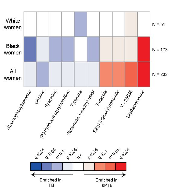
It’s from a study [1] on correlations between pre-term births and various chemicals that may or may not be associated with the vaginal microbiome. The topic is important and the authors amass an impressive dataset. In part of the paper, they assess the impact of various “metabolites” that were sometimes present. Imagine 10 different chemicals that we can assay in mothers who, later, delivered at- or pre-term. We might want to see a graph of how these chemical abundances differed in the two groups, or how much more probable it is to find each chemical in the term- or pre-term birth groups. Instead, we get this, a graph of the p-values of the correlations:
To see why this is so awful, imagine that our effect sizes for the 10 chemicals — fraction of term minus pre-term pregnancies in which they were detected, or however one wants to define the measure — were as follows:

(These are means and standard errors for random numbers I drew, not actual data. The dashed line is an effect of zero.) Of these 10 simulated chemicals, which would be the one that’s most concerning, or that you might want to investigate further? Number 9, of course. But here are the p-values for this same set of data, with a dashed line at the magical value of 0.05:

The “most significant” is Chemical #6. Do we care about #6? Of course not! It just happens to be the one in which we have the greatest confidence about the effect size. The p-value tells us nothing about the effect size itself! (Moreover, graph #1 also clearly shows the confidence in the effect sizes — that’s what error bars are for.) But, you may ask, why don’t I just look at the authors’ graph of effect sizes instead of complaining about the p-value plot? Because there isn’t a graph of effect sizes! (There’s a panel with three of the ten, but not all 10.) It boggles the mind.
A brief advertisement
If you read my posts often, you’re not surprised by this interruption! Pop-science biophysics book announcement. (Nothing new since last time.) Read about it here or at the publisher’s site!
Now back to our topic.
Speaking of p-values…
… we also had a nice discussion of this plot:
If you don’t see what bothers me about it, click on this excellent xkcd comic.
(Randall Munroe , xkcd author/illustrator, has a far better grasp of statistics than most scientists. This recent comic is great, too.)
There was discussion of even more topics related to this paper, ending on the positive and interesting question of what the next steps for a study launched by this one’s data could be.
I’ll end with that, too.
Today’s illustration.
Once again, I attempted a watercolor copy of a Wayne Thiebaud painting, this time Sun Fruit, and once again it’s not very good. Painting it makes me appreciate even more how great the original is.
— Raghuveer Parthasarathy; November 2, 2021
[1] William F. Kindschuh, Federico Baldini, Martin C. Liu, … Tal Korem, “Preterm birth is associated with xenobiotics and predicted by the vaginal metabolome”, bioRxiv, 2021. Link: https://www.biorxiv.org/content/10.1101/2021.06.14.448190v1.full

Raghu:
I agree completely. For an example, see figure 1 of this article
Wow! The quote you include from the magnetic field researcher is pretty appalling: ““Blackman was trying to figure out why fields with frequencies of fifteen, forty-five, seventy-five, and a hundred and five hertz should have such a strong effect on calcium-ion outflow from chick-brain tissue, while fields of thirty, sixty, and ninety hertz produced only a weak effect.” He’s like Skinner’s
randomly stimulated pigeons.