
This week’s bad graph* plots three-dimensional data with a squashed perspective, hiding any scatter of the points along the “out of plane” axis:
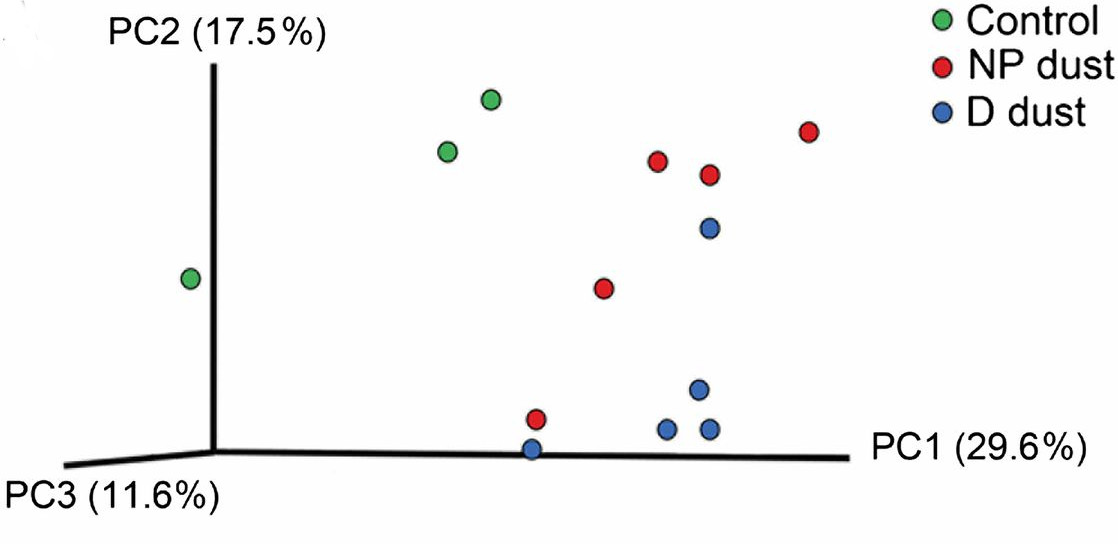 The cognoscenti will recognize the plot as visualizing the outcome of principal component analysis (PCA), in this case applied to the microbial communities in mice fed dust from homes** with dogs (D) or with no furry pets (NP). ‘Control’ is no dust. One looks in these graphs for indications that different experiment types cluster differently in the parameter space. It’s fairly evident that there’s no distinct clustering of D and NP points in the PC1-PC2 plane, despite the authors’ claims to the contrary. What about in the 3-axis space? Good luck figuring that out… Why show the third axis, if one is going to hide its dispersion from the reader? From Fujimura et al., Proc Natl Acad Sci., 111:805-810 (2014).
This reminds me:
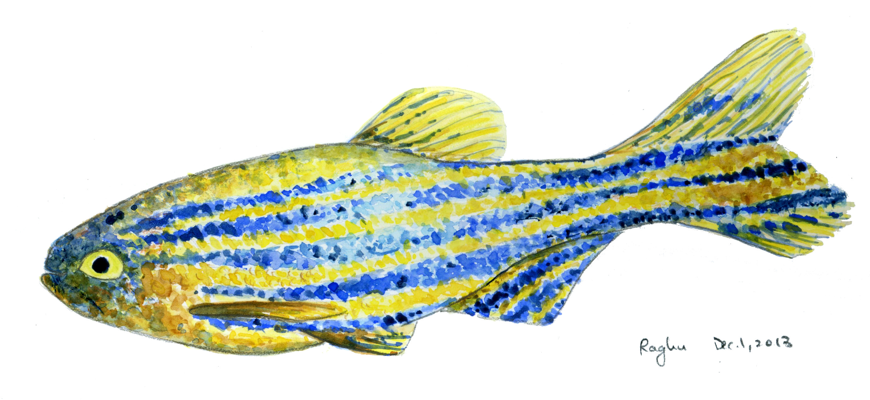 I painted a zebrafish a while ago, since my lab works with them a lot and I don’t have an illustration of one that I really like. It’s not great, which was confirmed by K. (age 8), who noted that the stripes are too straight, making the fish appear flat. I haven’t shown him the PCA graph.
* “This week’s bad graph:” I’m really hoping this doesn’t become a regular feature. [For the last example, see https://eighteenthelephant.wordpress.com/2013/11/03/another-bad-graph/]
** “Homes” is a bit strong: the dog-derived dust comes from one house. Apparently it’s hard to find homes that contain dogs. The non-dog-dust also comes from one house.
