

Last term, I taught The Physics of Solar and Renewable Energies, a course for non-science-majors at the University of Oregon. I’ve taught this course several times and I wrote a blog post about it in 2021 (link). Here are some thoughts on this Spring’s iteration. Enrollment for this course fluctuates between about 50 and 150 people, possibly a function of what other gen-ed science classes are being offered that term; this time, there were about 60 students. The syllabus is here.
The goal of the course is to convey an understanding of alternative energy sources — how we harness them, and their abundance and accessibility. “Alternative” means “non-fossil fuels;” we cover hydropower, wind, solar, and nuclear in ten weeks that go by very quickly.
Mini-projects and Wind Power
My favorite part of the course is our estimation of how much power is available from various sources — not the limitations of infrastructure or economics, but the more fundamental limitations set by basic physical laws. Moving air carries kinetic energy, for example, and the power output of a wind turbine can’t exceed the rate at which this kinetic energy flows, regardless of how we might design blades or generators. What’s more, the upper bound on the power output of a wind farm depends only on the wind speed, the (unchanging) density of air, and the overall land area of the farm, not on the size of the individual wind turbines! (See Mackay’s Sustainable Energy – without the hot air, Chapter III.C, for a brief explanation.) There’s a subtle size dependence, but to “lowest order,” as physicists like to say, it’s irrelevant. It takes a few weeks, but all this can be figured out with basic algebra, minimal physics, and no prior exposure to physics. We introduce the concepts of power and kinetic energy and see where they take us.
As in past years, all this leads to a “mini-project” in which students look up data on wind speeds in various U.S. states and a few parts of other countries and estimate the potential power if 1% of the state (10% of the windiest 10%) were used for wind farms. Then they compare to current, actual wind power generation. Here’s the graph I made, for all U.S. states:
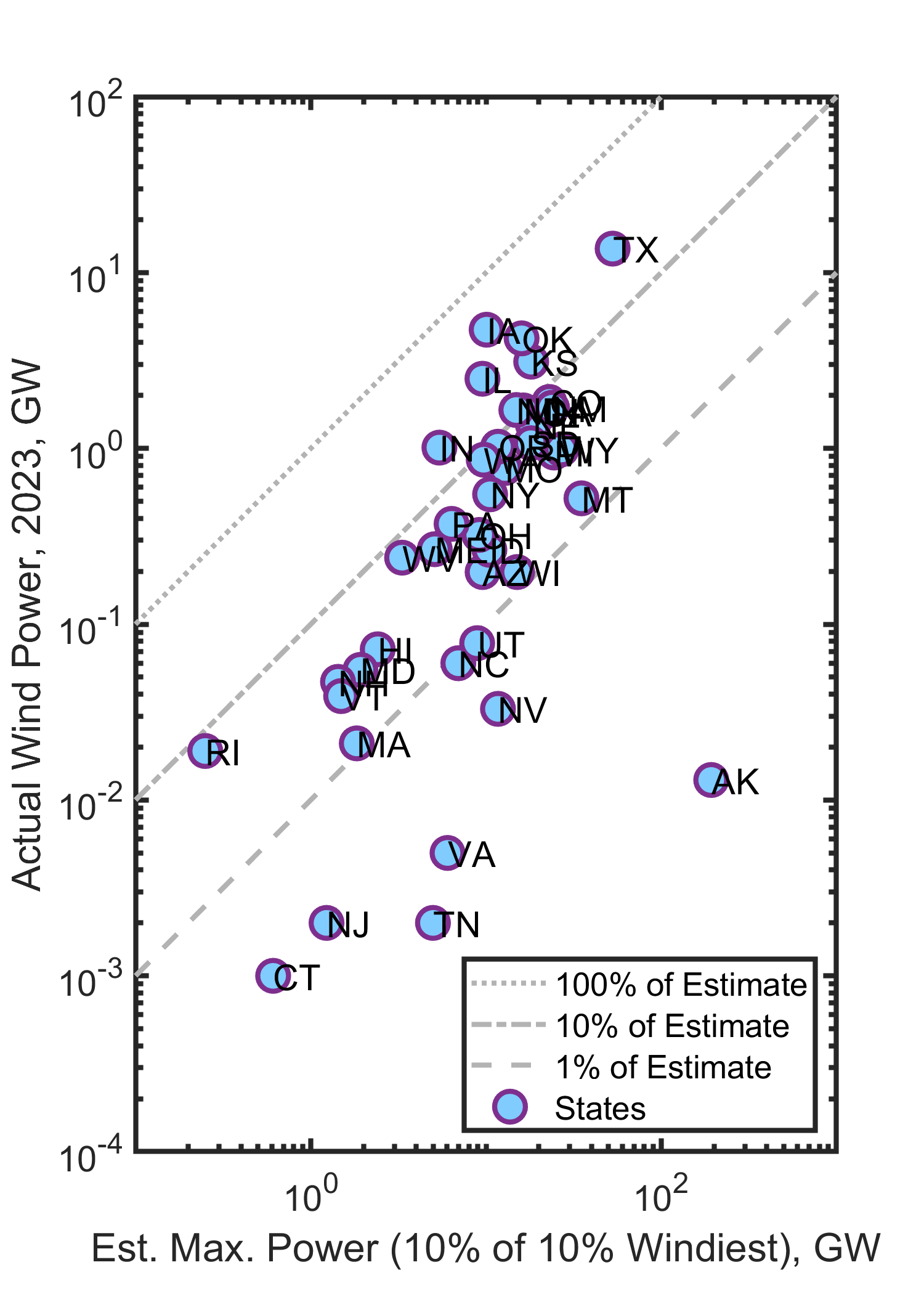
A point on the dotted (uppermost) line would indicate a state in which this estimate and the actual output are equal. No states are on this line, though Iowa comes close! Many states are near the middle line, actual power generation being one-tenth of this estimate. We can also see from the vertical axis that Texas generates a lot of wind-derived energy! Overall, it’s well within the bounds of physics to expand wind power in the U.S. by a factor of 10, but hard to imagine more than this. Wind currently supplies 1.6% of the energy consumed in the United States.
We do similar exercises for hydropower (much less scope for increase) and solar power (much more room to grow).
How do the mini-projects work in practice?
The most important characteristic of courses for non-science majors is that the students’ variance along any axis you might think of — enthusiasm, conscientiousness, literacy, mathematical skill, organization, … — is enormous. People who only teach courses for majors, or upper level courses, have a hard time comprehending this. The students are a cross-section of the university, and since the University of Oregon is a mildly selective public university, a cross-section of much of society. The range makes teaching challenging.
The ideal way to structure an assignment like this would be to introduce the concepts, point students to the data sources, and have them figure out how to proceed, answering questions along the way. Unfortunately, the vast majority of students need far more scaffolding than this. You can see the assignment structure here, modified (and made even more explicit) from prior years’ versions. I refer to examples we did in class (and that I recorded on video) that can fairly mindlessly be cranked through for other states or regions. Students submit an Excel file with their numerical answers, and a PDF with observations and explanations. I wrote code to analyze and score the Excel files.
I’ve learned that spreadsheets are completely alien concept to many students — about half. Estimating wind power follows the same process for every state, but with different values of wind speed and land area, and so is ideal for tackling with a formula applied to rows in a spreadsheet. I demonstrate this. Bizarrely, a sizeable number of students still proceed to tediously calculate each value by hand, punching numbers into a calculator, for reasons I do not understand.
Some students get excited by the mini-projects. Many have commented on the appeal of working with real data about real places, and it’s rewarding to hear students make observations about similarities and differences between states, or between different power sources. It’s also the case, though, that many students seem to find the mini-projects uninspiring and tedious. I’m not sure what the solution to this is. There’s an inherent conflict between two ongoing trends: declining skills among college students, which calls for less ambitious and more formulaic exercises, and the increasingly impressive abilities of artificial intelligence, which calls for less formulaic and more open-ended exercises that build human strengths.
I don’t know how to resolve this conflict, but I nonetheless intend to continue with these sorts of projects!
Active seating revisited
The most successful educational experiment I’ve done has been the “active seating zones” I implemented to improve engagement in large gen-ed courses like this one. I described this in a blog post last year that’s gotten 1400 views so far. In brief: I allow students to sort themselves into two areas, an “active” zone in which they (and I) can expect students around them to participate in small-group discussions, and a passive zone in which this isn’t the case. The motivation was that an insufficient level of overall student engagement can thwart students who want to actively participate, as they may not have like-minded classmates near them. This is demoralizing, and it deadens the class. Like a critical mass in a fission reaction, one needs a critical density of active students, and this layout of zones helps this happen. This was a great success last year; the mood was great (for everyone). Interestingly, there was a huge impact on grades, with students in the active zone scoring on average an entire letter grade higher than the non-active zone.
I implemented the active / non-active zones again this past term. It was again successful, in the same ways, but not as dramatically. The key problem that I didn’t adequately anticipate was that the classroom I was in was over twice as large as it should have been given the enrollment. Therefore even the active section was sparser than it should have been, making discussion difficult. I perhaps should have cordoned off part of the room — I’ve tried this in the past and it’s hard to consistently enforce — or done something else to artifically induce density. Still, the atmosphere was better than usual for a gen-ed class, and student feedback was positive. Students in the active region did, on average, half a letter-grade better than the non-active regions.
Notably, a Math Department colleague tried the “active seating” experiment in a 400 student introductory statistics course and also reported that it was great for engagement and atmosphere! Similar to my course this term, the final exam grades were about half a letter-grade better for the active region. (The p-value is 0.004 since the number of students is so big!) Half a letter grade may not sound like much, but for education research this is an enormous effect. (Cautions: correlation & causation, etc.)
Correlations and grades
Speaking of correlations: There are a variety of components to the overall course grade: pre-class reading quizzes, post-class notes, a tiny participation score, approximately-weekly quizzes, homework, the above-mentioned mini-projects, a midterm exam, and a final exam. (See the Syllabus.) How do each of these correlate with the overall course grade? I calculated the Pearson correlation coefficient of each component vs. the overall course grade determined without that component. The quizzes show the strongest correlation (r = 0.82) and the projects the weakest (r = 0.42).
The most interesting correlation is homework. Most physicists, me included, consider doing homework to be an excellent way to learn — thinking deeply, revisiting puzzles over the course of days, having “eureka” moments of realization that stick in one’s mind. One wants to encourage and reward this. It’s also the case, though, that now especially, it is possible to complete homework assignments without understanding anything — artificial intelligence has made it trivial for the student who lacks self-discipline to instantaneously get a perfect, or near-perfect answer. The homework – course grade correlation coefficient was r = 0.51. I have data for this exact course for recent years, but before plotting it I should make sure I’m making the same comparison for all datasets, and that I’m excluding data from people who didn’t complete the course. Stay tuned for a future blog post; in the meantime, make your predictions for whether r was larger or smaller in the recent past!
Here are all the grade components and their correlation coefficients, r, with the overall grade (not counting that component):
| Component | Weight for Course Grade | Pearson r |
| Reading Quizzes | 7% | 0.616 |
| Post-class notes | 5% | 0.633 |
| Participation (iClicker) | 3% | 0.535 |
| Quizzes | 20% | 0.817 |
| Homework | 13% | 0.505 |
| Projects | 12% | 0.419 |
| Midterm Exam | 20% | 0.657 |
| Final Exam | 20% | 0.744 |
Back to science and technology
Whenever I teach this course, students are amazed by how little we use nuclear power, given the abundance and energy density of its fuels, and its safety. Considering electricity, the death rate per unit of energy generated is 1000x smaller for nuclear power than the death rate from fossil fuel use, and that’s including the Chernobyl disaster and excluding consequences of climate change. (Graph) We briefly discuss costs and politics that have derailed nuclear power, but these aren’t really in the purview of this (brief) course.
More positively, it’s also amazing how dramatically the cost of solar power has plummeted, from about $100 per Watt in 1976 to less than $1 by 2020! (Graph) This wasn’t predicted (at least not by economists!), and highlights the practical benefits of research into materials and physical processes. The stunning, steady improvement in our ability to harness sunlight, together with the abundance of solar power hitting our planet, should help make one optimistic about the long-term prospects for renewable energy.
Today’s illustration…
Yucca flowers, which grow in my front yard. The painting didn’t turn out well, but I’m not going to redo it. The plants like solar power.
— Raghuveer Parthasarathy, July 17, 2025
