

Assessing exams
I’m fond of analyzing the outcomes of exams I give. My favorite assessment is to look at how the score on each exam question correlates with the overall total score, and to plot this correlation coefficient versus the fraction of students who got that question correct. Roughly, I’d like the plot to turn out like the orange arc here:
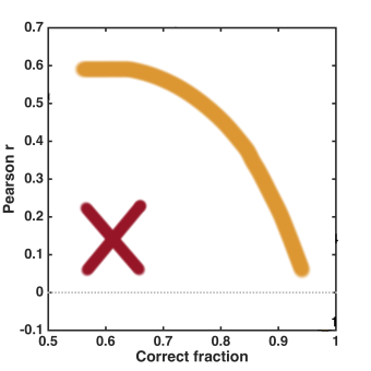
Questions falling in the lower right show that most of the class understands the topic being asked, and of course I want a lot of the “core” material of a course to be followed by nearly everyone. The questions in the upper left are not so simple, but the fact that they correlate well with overall performance indicates that they’re probably not difficult because they’re opaque, but rather that they correctly,and usefully, discriminate based on students’ grasp of the topic. (This is similar to the “item discrimination index” commonly used by people who design tests, see e.g. this and this.) I hope to avoid questions that fall into the lower left corner (the red “X”) — questions that are answered correctly by a low fraction of students, and for which answering correctly isn’t correlated with answering other questions correctly. It’s likely that these questions, despite my best efforts, are misleading or otherwise flawed. Usually, a few things lie in this corner and, since this indicates bad questions, I generally toss these out of the overall exam scoring. (I tell this to the students.)
My correlation plot for the second exam of my “Physics of Energy and the Environment” course this past term, however, turned out wonderfully:
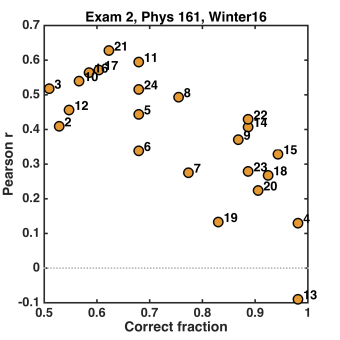
There’s nothing in the lower left! Technically, this doesn’t represent the entire exam — there were 24 multiple choice questions (indicated by the numbers on the plot) and 5 short answer questions, whose correlations I didn’t bother calculating. Nonetheless, I’ll conclude that I’m pleased by the above plot! I’ll also note that it’s very easy to do this assessment — I highly recommend it.
Assessing my course
Overall, this past term’s teaching went pretty well. “Physics of Energy and the Environment” is a general education course for non-science majors that I’ve taught before, and as always I try to incorporate a lot of “active learning” — lecturing as little as possible, and having students figure things out through guided questions and worksheets. (It takes energy, both from me and from the students, but it works well.) The syllabus is here.
My course evaluation scores for “course quality” and “instructional quality” were 4.3 out of 5.0 and 4.5 out of 5.0, respectively. Comparing to *all* general education Physics courses taught at UO since 2008, for which I’ve tabulated evaluation scores, three things pop out of the histogram. (I’m just plotting the “instructional quality” histogram, but all the categories are strongly correlated with each other.)
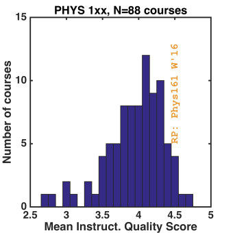
First, I’m doing pretty well (about 1.5 standard deviations over the mean in “instructional quality”). I put a lot of work into the class, and often ask myself whether I’m wasting my time and energy. Of course, the answer may well be “yes,” but at least by some metric, there does seem to be some positive outcome to it. Second, the mean score for the department is quite high. I haven’t compared to other departments, but I do think ours has a lot of people who care about teaching. (Given that tuition provides over 80% of the income of the university, it is stunning that there are people who do not!) Third, the dynamic range of the plot is very narrow. (The standard deviation divide by the mean is 0.1!) This holds, I think, in general — even courses that (I’m told) are awful tend not to score much lower than 3.0. Why is this? I really don’t know.
A final graph: Here’s the distribution of final grades in the course:
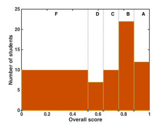
The bins indicate how many students got each final letter grade. The course isn’t curved — in principle, everyone could get an “A,” or everyone could fail. About 5 of the F’s are “real” — the rest are students who never showed up, or soon stopped showing up. (There are always some like this.) What “should” the distribution of grades look like? In a course like this, I really do think that everyone, or nearly everyone, in the class is capable of getting an A, but the realities of student motivation and diligence are such that many do not. (I think most students would agree — in the written evaluations, lots of people commented on how fair the grading and the structure of the course were.) I’d be curious to see the grade distributions for all UO courses, especially broken down by levels. There’s a lot more, in principle, that one could do with this, especially if one had access to data on students’ performance in other courses — are low grades in a gen-ed course like this one indicative of doing poorly in general in college, or are the low-performers saving their time and energy for “important” courses? I’d bet money on the former, and I’d also bet that addressing the existence of the poorly motivated and poorly organized would do wonders for the university, and for these students. But for now, this will have to remain a mystery.
Today’s illustration
Seed capsules from a “princess tree” (Paulownia tomentosa), again painted from a photograph in Trees up close (text by Nancy Ross Hugo, photos by Robert Llewellyn).

In the education world, this is called the discrimination index. I once applied it to a few years of PHD qualifying exams – quite illuminating.