
I like graphs. At their best they are useful, elegant, and thought-provoking. At their worst, they’re infuriating. Modern systems-ish biology seems to have an abundance of awful graphs, even in good papers (as noted earlier, for example), perhaps because the complex statistical procedures it often uses are hard to make sense of. There’s no excuse for this week’s example, though, which isn’t something complex and abstract, but rather something extremely simple. Here it is (from Karlsson et al., “Gut metagenome in European women with normal, impaired and diabetic glucose control,” Nature 498: 99-105 (2013)):
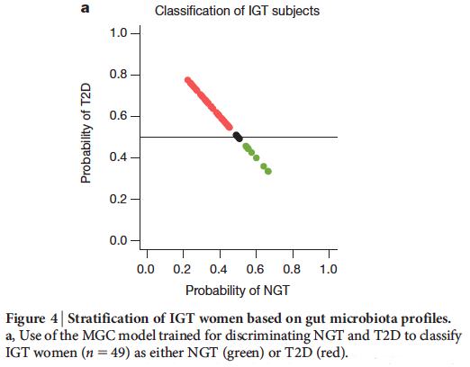
The authors, based on an interesting analysis of microbial communities in diabetic and normal people, make a prediction for which members of a third group will or will not become diabetic. On the vertical axis we have the probability of being Type 2 Diabetic (T2D). On the horizontal axis we have the probability of being normal. There’s a clear, important trend evident, right? No! The probability of being normal is trivially one minus the probability of being T2D! The graph could not possibly be anything other than a straight line of slope -1. (For the students out there: the complete lack of scatter in the graph is a strong hint of something wrong.) What about the colors? They assign the data points for people with a > 50% probability of being T2D to be red, and the opposite to be green. The graph is simply plotting a tautology, that the probability of x is one minus the probability of not-x, together with a color scheme for labeling x. Paraphrasing Tufte, it has an information-to-ink ratio of approximately zero. And it’s in Nature!
I’ll stress that the study itself is fascinating. The authors untangle correlated microbial constituents that differ between diabetic and non-diabetic people using clever analyses of microbial sequencing data. Notably, the authors find that their markers for diabetes, developed by analyzing 70-year-old Swedish women, fail quite completely to describe the occurrence of diabetes in a very different Chinese population, implying that prediction based on microbial censuses need to population-specific. (The paper was the topic of our “microbial ecology journal club” last week.) I, and other people at journal club, have issues with other graphs in the paper as well whose meaning or message is blurry, but these fall under the more common category of statistics-visualization challenges.

2 thoughts on “(Another) bad graph”